
Photo by NordWood Themes on Unsplash
The Perfect Way to Use Design System
A comprehensive guide on how to use design systems effectively


Is there really a perfect way to use a Design System?
The answer is NO. why? Since there are recommended steps and procedures to follow when creating a design system, it is crucial to recognize and acknowledge that there is no one-size-fits-all "perfect" way to use a design system.
This article is here to provide you with a comprehensive guide on how to use a design system effectively, whether you're working alone or with a team. We’ve got you covered.
What is a Design System?
A design system is a special set of instructions and rules that help you build your project in a consistent and organized way.
Imagine you are building a big LEGO creation, like a city with different buildings, roads, and people. In the design system for your LEGO city, you would have a specific color scheme, like using mostly red, blue, and yellow LEGO bricks. This makes sure that all the buildings and objects in your city look like they belong together. You might also have a set of rules for how tall the buildings can be, how wide the roads should be, and where the trees and parks should go. These rules help you create a city that looks neat and well-planned.
Just like in your LEGO city, a design system for digital things, like websites or apps, helps designers and developers create things that look good and work well together. It includes things like a chosen color palette, a set of fonts for the text, and icons that represent different actions or ideas. It also provides rules for how buttons, menus, and other parts of the design should look and behave.
By using a design system, designers and developers can make sure that all the different pages and features of a website or app look consistent. This means that when you use a website or app, it feels familiar and easy to use because the buttons and menus work the same way everywhere. It's like having a LEGO city where all the buildings, roads, and people fit together perfectly!
A design system helps designers and developers work faster too. Instead of starting from scratch every time they create something new, they can use pre-made pieces from the design system, just like using LEGO blocks to build your city. This saves time and makes it easier to create things that look great and work well.
So, a design system is like a special set of rules and pre-made pieces that help designers and developers create digital things that look consistent, work well together, and are easier to build. It's like having a plan for your LEGO city to make it awesome and organized!
Importance of using a design system
From our explanation of what a design system is, we can see that using a design system, whether for building a LEGO city or designing digital products, is important because it brings consistency, efficiency, cohesion, and collaboration. It helps create a visually appealing, well-organized, and user-friendly experience. Just like a well-designed LEGO city, a digital product created with a design system will be more enjoyable and engaging for its users.
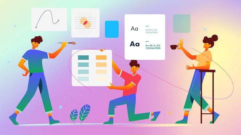
Components of a design system
Design systems greatly enhance the quality of your design work and help you better understand design best practices, especially if you're new to the field. Now we will go into detail about the major components of a design system.

Typography:
In a design system, typography is like picking the right style of writing with different sizes and shapes of letters so that everything looks neat and people can read it easily. Clear and well-designed typography reduces eye strain and improves legibility, enhancing the overall user experience. It ensures that users can easily absorb information, navigate through content, and engage with digital interfaces. Choosing the right typography is key to creating effective and engaging designs that effectively convey information and capture attention.
The image below is the typography I used to create a design system used for an ed-tech product to help nursery kids learn the alphabet.
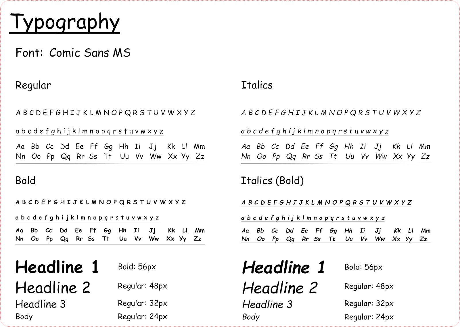
“My thought process”
When choosing fonts for an Ed-Tech product aimed at teaching kids the alphabet, I made sure that I prioritized readability, simplicity, and a child-friendly appearance. So after researching, I ended up going for a child-friendly sans serif font, "Comic Sans MS," because Sans serif fonts are clean, modern, and easy to read. They lack the small decorative lines (serifs) at the ends of characters, making it easy for kids to learn.
Color Palette:
In a design system, a color palette is like having a special set of colors that you can use. It's like having a collection of crayons or markers that you can choose from to make sure all the colors you use in your design look nice together.
A color palette ensures that all the colors used in a design or artwork work well together and create a cohesive visual experience. By establishing a set of colors that harmonize and complement each other, a color palette helps create a consistent and unified look across different elements of a design, such as backgrounds, text, buttons, and illustrations.
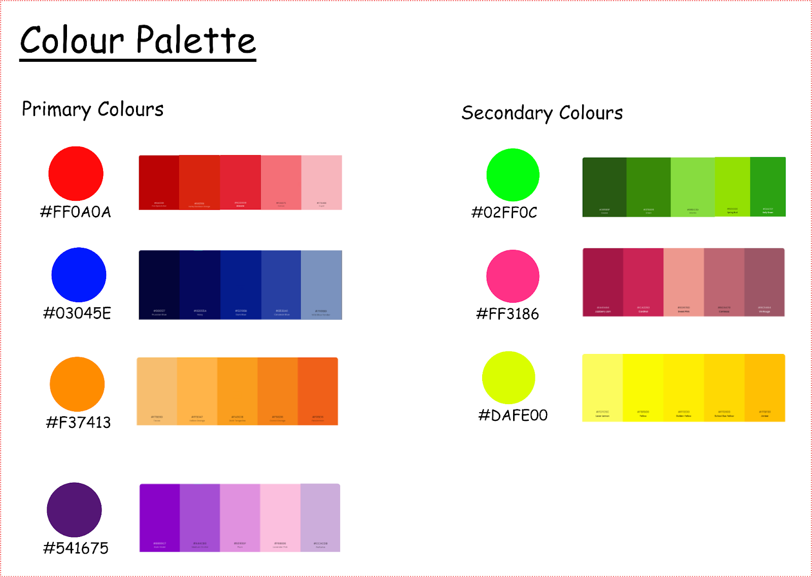
“My thought process”
For the Color palette of the Ed-Tech product aimed at teaching kids the alphabet.
I chose those colors because they are bright, vibrant colors that are visually appealing and engaging. The colors also help promote a positive learning experience for kids. I also ensured that the colors are accessible and that there is sufficient contrast for readability while maintaining a balance between the colors to avoid overwhelming the young learners with too many colors.
Iconography:
Icons are like little pictures that represent something, like a symbol or an idea. In a design system, iconography means having a collection of these little pictures that you can use in your design. It's like having a library of tiny drawings that can help people understand what something does or means just by looking at the picture.

“My thought process”
I ensured that the icons I used were visually appealing, age-appropriate, easily recognizable, and engaging for young learners by following these steps:
Utilizing simple and easily recognizable icons to represent actions or concepts
Incorporating friendly and relatable illustrations to engage children.
Ensuring that the icons and illustrations I used are age-appropriate and aligned with educational content.
Buttons and Forms:

Buttons: Buttons are like the clickable parts of a website or app that you use to make things happen. They can be different shapes and sizes, like squares, circles, or rectangles. Buttons are often labeled with words or symbols to tell you what they do. For example, a button might say "Play" to start a game or "Submit" to send a form. In a design system, buttons have a specific style, color, and size that makes them all look consistent and easy to recognize. This way, people can quickly understand what they can do by looking at the buttons.
Forms: Forms are like spaces where you can fill in information or answer questions on a website or app. They can be used for things like signing up for an account, entering your name, or leaving a comment. Forms usually have different fields, like boxes to type in text, checkboxes to choose options, or drop-down menus to select from a list. In a design system, forms have a specific style and layout, so they all look similar and work in a similar way. This makes it easier for people to understand how to fill out the form and complete the task.
Buttons and forms are important in a design system because they make it clear and easy for people to interact with websites and apps. When buttons and forms have a consistent style and behavior, it helps users know what to expect and how to use them. This makes the experience more user-friendly and helps people complete tasks quickly and efficiently.
The Best practices for using a design system are given below:
Just like following the rules in a game, using a design system's best practices leads to awesome results! It ensures that everything looks consistent, works well, and helps everyone be more creative and efficient in their work. Below are the best practices that I recommend for you:
1. Follow the rules: A design system has rules and guidelines to help everyone create things that look consistent and nice. It's important to follow these rules, like using the right colors, fonts, and buttons, so that everything fits together and looks awesome.
2. Keep it up to date: Just like you update your favorite game or puzzle, a design system needs to be updated too. This means adding new things, improving existing parts, and keeping them fresh. By updating the design system, it stays useful and helps create new and exciting things.
3. Work together: When using a design system, it's important to work together as a team. Designers and developers can share ideas, give feedback, and help each other make things even better. By collaborating, everyone can make the design system even more awesome.
4. Share the rules: It's essential to tell others about the design system and how to use it. This means explaining the rules, guidelines, and examples to everyone who needs to create things using the design system. Sharing the rules helps everyone understand how to use the design system correctly.
Case Studies and Real-world Examples
Google Material Design: Google created a design system called Material Design that helps their apps and websites look and work consistently. They have specific rules for colors, fonts, and shapes that make everything look nice and easy to use. This helps people recognize Google products and have a familiar experience across different devices.
Apple Human Interface Guidelines: Apple, the company that makes iPhones and iPads, has a design system called Human Interface Guidelines. It provides rules and recommendations for how apps should look and work on their devices. This helps app developers create user-friendly and consistent experiences for Apple users.
Shopify’s Design System Polaris: Shopify is a company that helps people create their online stores. They have a design system called Polaris to make sure all the online stores created on their platform look nice and work well. Polaris has guidelines for colors, fonts, buttons, and other design elements. It helps store owners make their stores consistent and easy to use, which makes shopping a better experience for customers
Microsoft Fluent Design System: Microsoft is a company that makes computer software, like Windows and Office. They have a design system called Fluent Design System that helps their software look and work consistently across different devices, like computers and tablets. The Fluent Design System has rules for colors, buttons, icons, and other design elements. This helps Microsoft create software that is easy to use and looks good, making it enjoyable for people to use their computers and devices.
Conclusion
In conclusion, the perfect way to use a design system is to embrace its principles and guidelines to create consistent, visually appealing, and user-friendly designs while prioritizing the needs of the users. By doing so, you can create exceptional digital experiences that are visually consistent, efficient, and user-friendly.